
Kennedy Starling Brand Project
Kennedy Starling came to me looking for a brand identity that felt confident, fit her unique style and personality, and was adaptable. I created a full design kit — from logo to social graphics — giving her the tools to present a unified look across her promotional material and online presence.
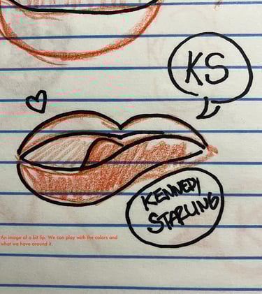
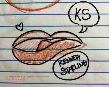
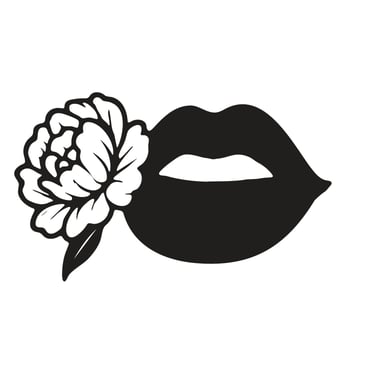
Idea Sketching Phase
We began with a series of quick sketches to explore different directions for Kennedy’s brand identity. These early concepts focused on symbolic imagery, typography, and attitude — helping us narrow in on the visual style she connected with most.
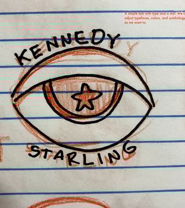
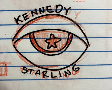
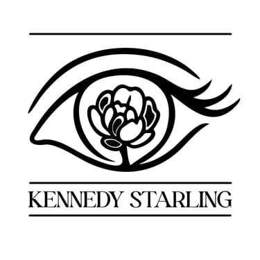
Comps Phase
Based on Kennedy’s feedback, I refined the sketches into a set of polished design comps. She wanted a peony incorporated into the identity, while still exploring the bold symbolism of eyes and lips. These variations provided distinct options for how her brand could take shape.
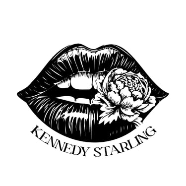
For the final mark, we focused on the more detailed lip-and-peony concept. I simplified the lip detailing while retaining dimension, and redrew the flower to feel closer to a real peony.
refinement phase
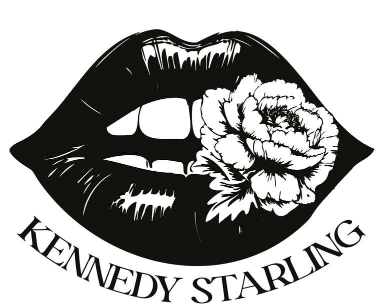
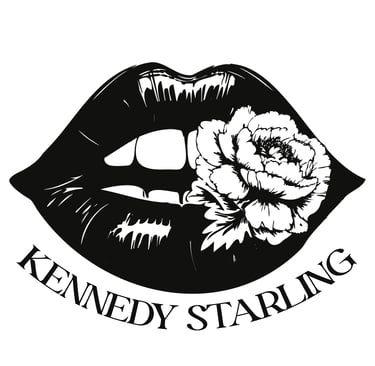
Finalized logo
The final logo brings together the sensual lip-and-peony motif with Kennedy’s custom color palette: a near-black navy for the lips and a soft pink for the flower. The result is a confident, versatile mark that captures both strength and femininity.

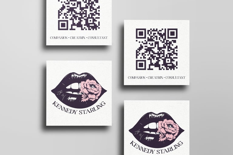
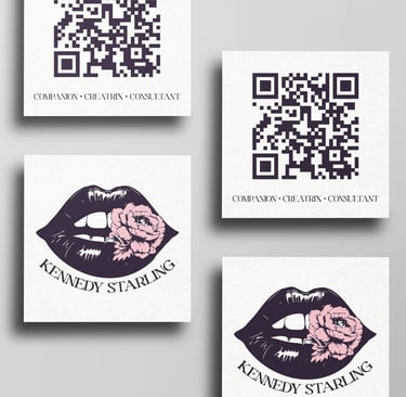
The business card design features the colored logo on the front and a QR code and tagline on the back. The QR code was created custom for the business card and points to a Linktree page where all of Kennedy's various sites and profiles can be found.
Business card
© 2025 Lewd Supply Co. All rights reserved.